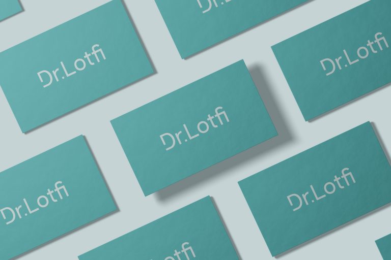
The Power of San Serif Typeface: At the core of your logotype resides the San Serif typeface, a design choice that conveys a remarkable blend of modernity and timelessness. Its clean and sleek lines epitomize professionalism, while the absence of decorative flourishes ensures clarity and legibility. The simplicity of San Serif captures the essence of your practice, emphasizing a commitment to precision and innovation.
Distinctive Typography: The typography chosen for your logotype was thoughtfully customized to create a unique visual identity for your brand. The careful balance between letter spacing and proportions ensures legibility and visual harmony, leaving a lasting impression on your audience.
Harmonious Color Palette: The logotype embraces a refined and harmonious color palette, with a shade of blue-green known as turquoise taking center stage. Turquoise is a captivating hue that combines the tranquility of blue with the invigorating freshness of green. This color choice symbolizes trust, reliability, and expertise, perfectly aligning with your practice’s core values. The use of turquoise adds a touch of elegance to your logotype, making it visually appealing and memorable.